Because German Edition had been released already. Yes, it was eBook format, but yet, if I got all the data from DMP, all I had to do was compiling them for print book edition. There would be not so much work, I thought.
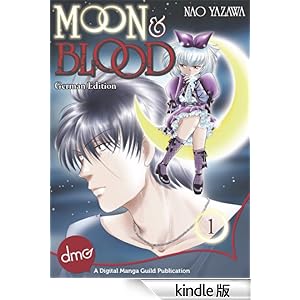
The very expensive Kindle German edition @Amazon.de. 7.45EUR.
For some reason, it's very expensive at Amazon. It's 2.95$ at eManga.con (Online reading, and you got another format for your e-book reader by+1$) I don't know why...and the quality of Kindle manga in West is poor. At least, the quality of my titles are poor. :( Amazon.JP is ok, so I don't know why Amazon.com doesn't offer the same quality kindle manga with Japan. )
The data can't be used for print because of the low resolution. I knew that. But they might have text layer - unrasterized. If they had, the low resolution doesn't disturb to make a data for print. That what I thought.
But I was wrong. The data I got was ping image, no text layers. Come to think about it, it's obvious because they order to productions the e-books, all the they dose are editing work.
So what I have to do ... copy&paste then break, copy&paste then BR, ... ... ...
(They gave me the translation script documents)
So what I have to do ... copy&paste then break, copy&paste then BR, ... ... ...
(They gave me the translation script documents)

I worked in the order (not particulate reason) vol.2, 3, 4, 1.
Yesterday, I got the proofreading documents from the translator. (She kindly gave it a QC). For some reason, vol.1 has many errors - it's the clear number one.
?? Because I was tired after 3 volumes' typing? Because the checker was fresh when she checked vol.1(it must be the first one). Because I got used to the work and started to do what I want at my choice (too much) ??
Anyway, there are some mistakes, especially the mistakes I did frequently were ...
BR at the wrong point.
I've done the same mistakes at my 4koma, like this....
I've done the same mistakes at my 4koma, like this....
It should be;
WAR ER
IMMER
But I did like this;
WAR ERI
MMER

I didn't type, just copy and paste, but I missed sometimes a space between words, because it's very narrow in the font I use. The alphabet tends to wide, it's not good for Japanese manga style balloons, so I prefer vertically long font like this. I knew it, and still, make the same error... ><; The one big reason is I don't speak German, yes.
If it was ordinary sentence, I mean it has lowercase characters, my mistakes will be less. But in that case, the line s@ace looks bad - because of the height difference of English letters, like "f" "g". The line will be jaggy. Not suitable characters for manga Alphabet is, anyway.
I didn't like the roundly font which is used manga commonly, but I've started to thinking it has the reason. At least, you can't miss a space when you use the font. I DL this font Anime Ace.

I also didn't like the dialogue without lowercase characters, but it might be the better way , it's jaggy free at least. I might never realized it if I didn't type by myself. There are things you never know without practices.
I wish this font was thinner bit more, though. This one is too fatty. :(
I'm so grateful for E-chan's work, she took time out for the proofreading!
I wish this font was thinner bit more, though. This one is too fatty. :(
I'm so grateful for E-chan's work, she took time out for the proofreading!
0 件のコメント:
コメントを投稿